Vladimir Mijatović
Vladimir Mijatović
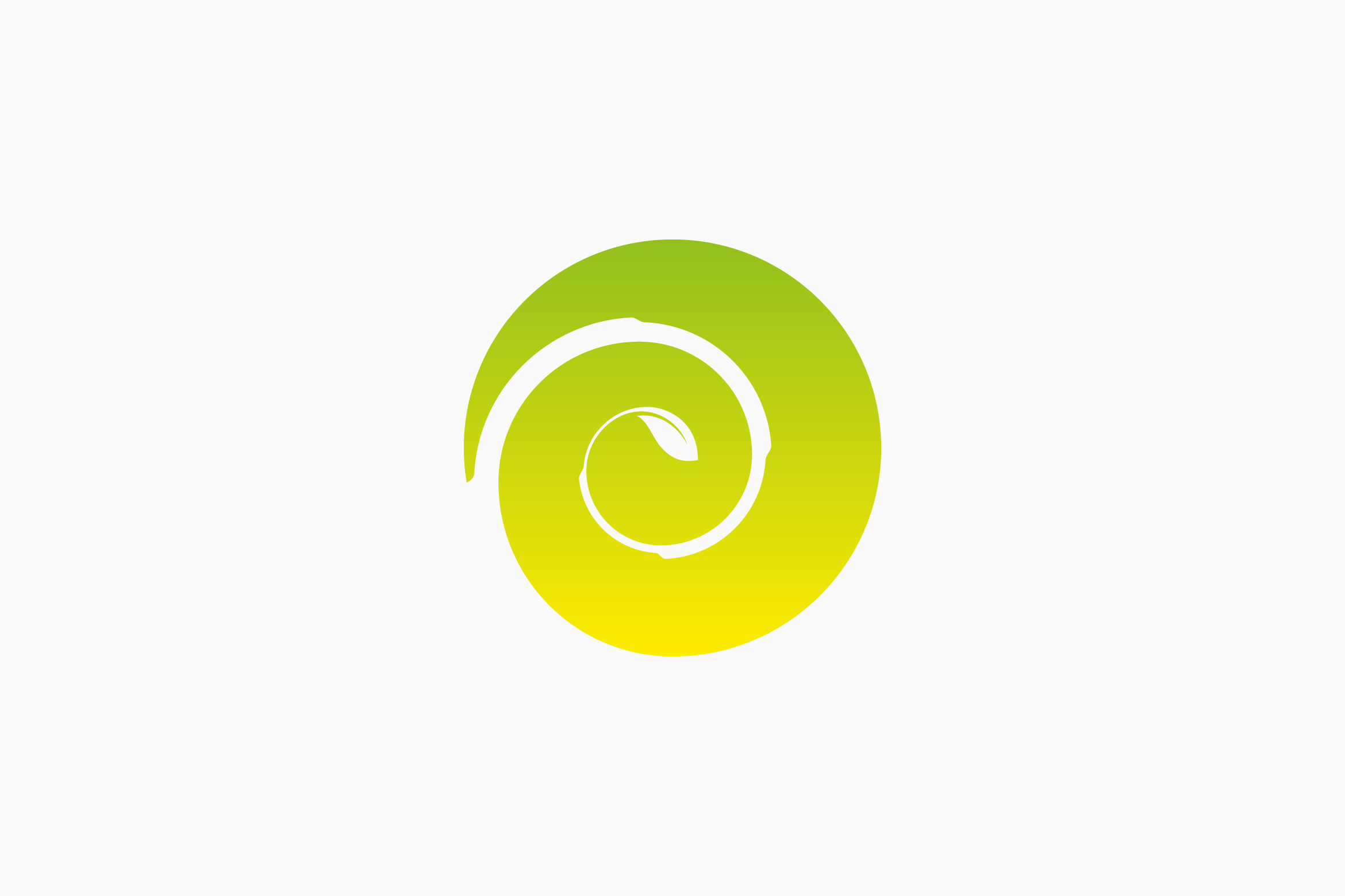
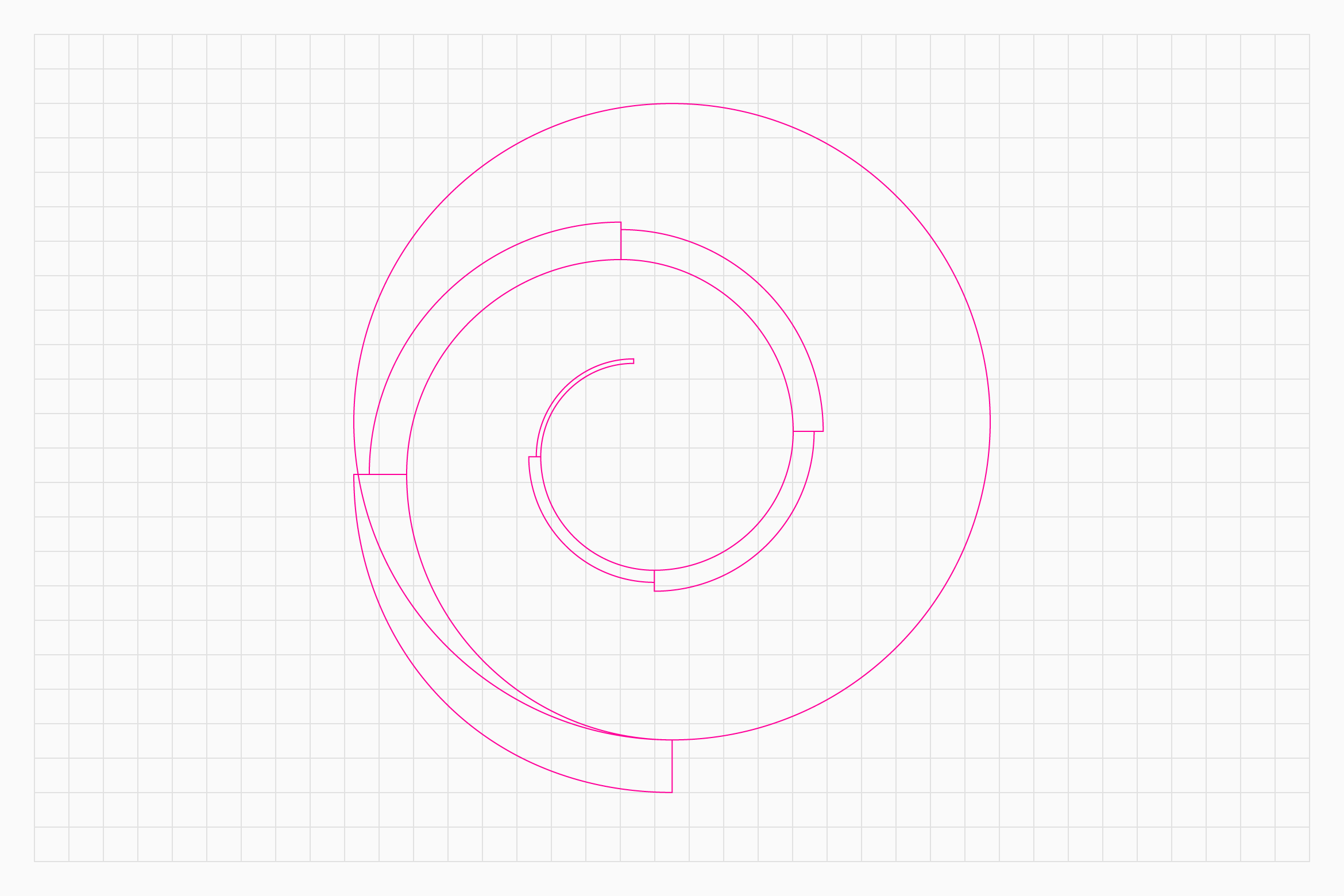
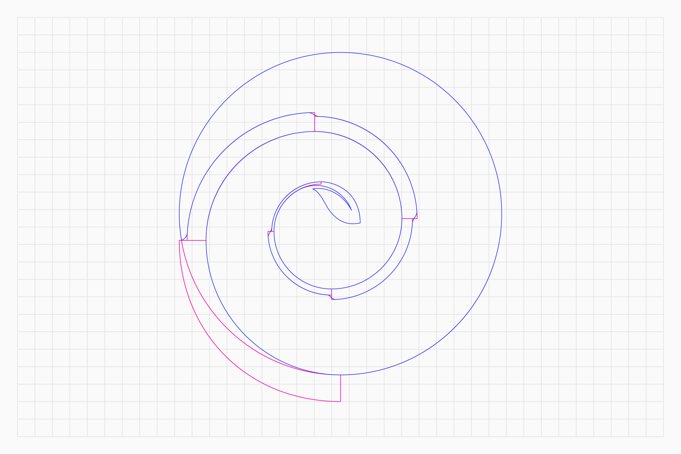
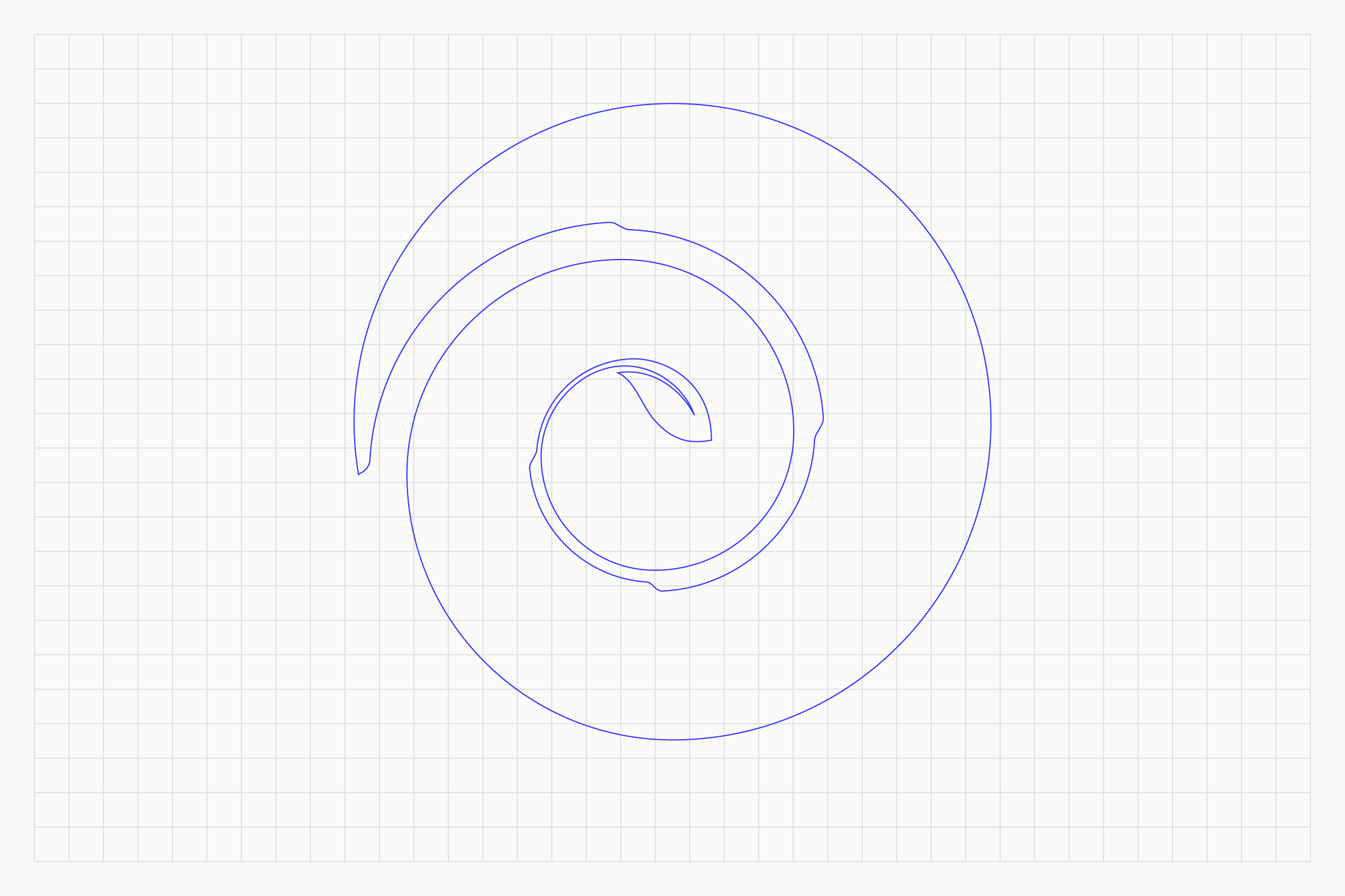
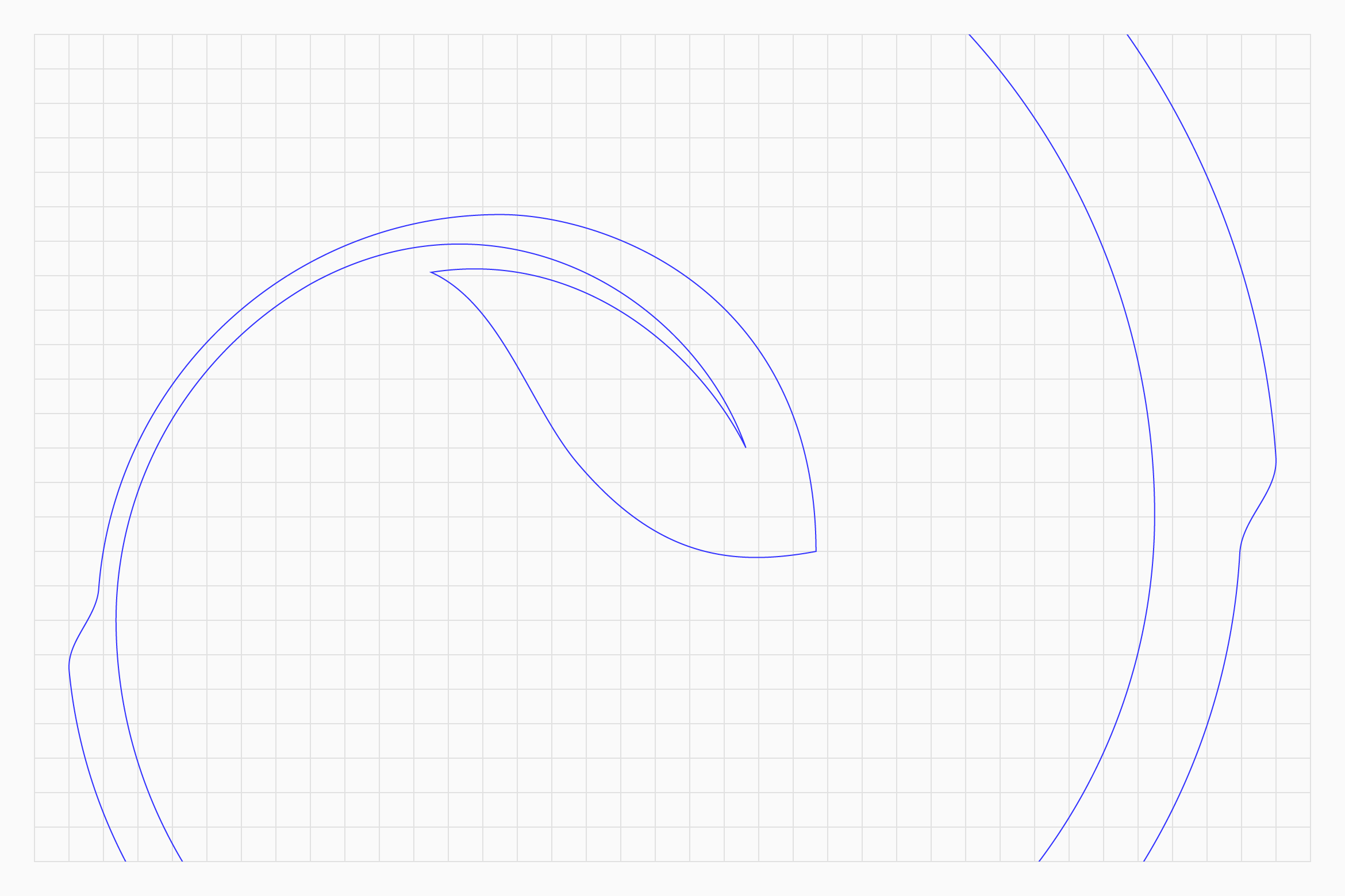
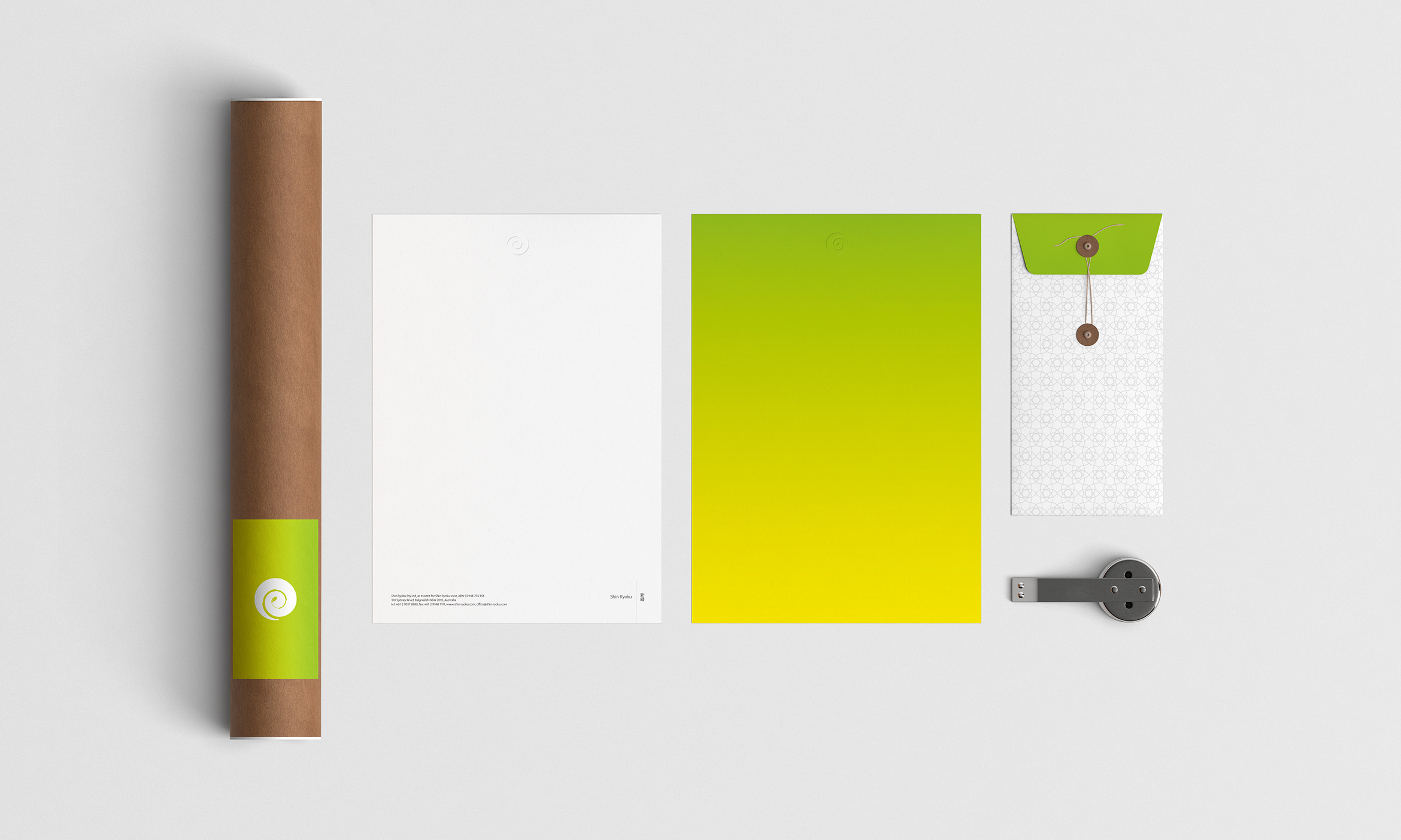
Japanese for “The New Green” – spring awakening. Shin Ryoku is a family company with Australian – Japanese origins. The request was the mark that would serve as a “kamon” or Japanese family crest. I came up with the unique symbol based on three core elements – a circle, a spiral and a leaf. Circle serves as the kamon base. Spiral – one of the most unique geometric and natural elements is a branch. The leaf at the end of the spiral represents “The New Green” or the seedling itself. Well accepted and already in use as a family symbol, Shin Ryoku mark sets tradition for the generations to come.